BANK
OF
AMERICA
REDESIGN
Bank of America’s current web app looks almost the same like it did a decade ago. Technically, it does the job; however, due to the unorganized task flows and unappealing visual presentation, the job itself feels more like a chore rather than a pleasant user experience or an opportunity for business to build connections with its users. Bank of America needs to renovate its web app and mobile’s UX/UI to make it look and feel better, improve its information architecture, and increase features’ accessibility to provide its users with a more fulfilling and personalized experience.

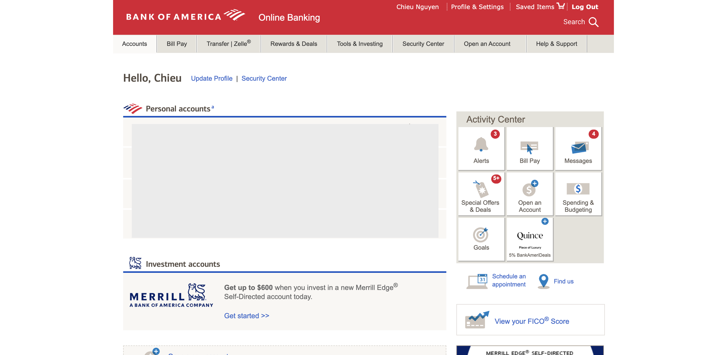
Accounts screen - bad use of real estate and poor information architecture 1. The screen does not spread for the entire width of the desktop; 2. The quick-access buttons (Activity Center) on the right hand side repeat the actions on the main navigation menu.

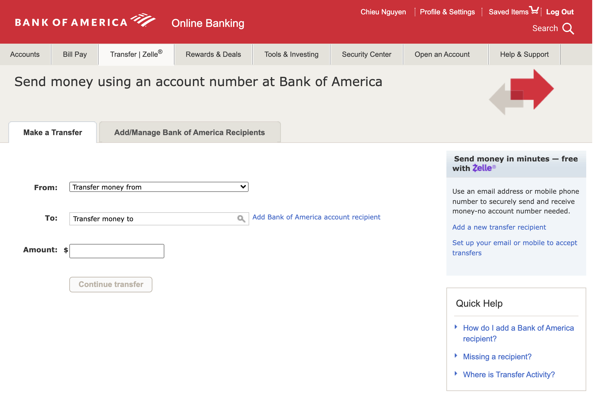
Transfer screen - looking and feeling very outdated.

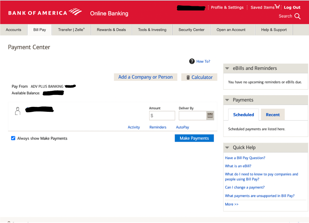
Bill Pay screen - uncompromising layout. Important information like Scheduled payments, Upcoming bills are downscaled and cluttered on the right side of the screen.
EMPATHIZE
I interviewed 6 people around me about their goals when using Online Banking. The following list is based on the most to less common goals:
Check card balances
View most recent transactions
Transfer money between accounts
Pay bills
Transfer money to another person
Deposit checks
View credit score
USER FLOWS
I create 3 user flows following the most common goals.
Flow 1: View Card Balance
Flow 2: Transfer Money
Flow 3: Pay Bill
DEFINE
Business Objectives
BofA’s objectives help clarify the direction of this redesign, and are synthesized as below:
Be able to provide and stay capable of providing customers with varied financial services through personal consultation and digital tools
Build and maintain trust for clients, employees, and stakeholders
Grow sustainably by pushing operational excellence, supporting its teammates and surrounding communities
The 5Ws
Who: Bank customers that receives services from the Bank and manage their financial activities through the Bank’s web app.
What: The web app that holds customers’ information and facilitate financial activities.
When: Bank customers use the web app to check their finances, send and receive money, deposit checks, or conduct other financial activities.
Where: Online via the Bank’s portal, accessible through multiple devices.
Why: To renovate the web app’s current outdated appearance and improve usability.
PROBLEM STATEMENT
BofA’s web app is currently outdated in form and function. Its poor information architecture and suboptimal use of real estate result in a questionable layout and unflattering aesthetics. The platform is filled with obsolete UI elements and lengthy business agenda while lacking a desired sense of personalization.
Altogether, these act as barriers to smooth and intuitive user experience.
IDEATE & PROTOTYPE
I addressed the application’s UI and infrastructure starting from the mobile app. Mobile-first is the necessary approach to make sure I satisfy users’ needs by providing adequate functions and designs before scaling them to bigger screens.
I conducted rapid prototyping by drawing up sketches on paper which allowed for quick adjustments to my ideas as I stayed consistent with my goals.
Happy with the results, I then moved on to create the low-, mid-, and high fidelity wireframes.
Flow 1: View Card Balance
1. Accounts screen captures the user’s key financial trends. User can easily scroll through their registered cards on top of the screen.
“Recent Transactions” lives on a slide-out panel.
2. The current BofA’s mobile app’s individual card view is somewhat busy. I redesigned the screen with only the most crucial information and command buttons so users can see things better.
Flow 2: Transfer Money
The process is broken down into smaller steps to reduce cognitive load.
“Top Contacts” is there for quick access.
Finally, a success modal reinforces positive experience.
Flow 3: Pay Bill
A simple flow with clear information hierarchy and interactive user input components.
MOBILE
Accounts
Credit Card View
Recent Transactions
Transfer
Bill Pay
Payment Details
DESKTOP
Accounts screen
Transfer screen
Bill Pay screen
DESIGN SYSTEM
COLORS
The new color palette honors the hallmark Blue and Red that have been representing the brand for decades. Yet, with the addition of Green to speak for the new environmental initiatives, the brand seeks to let known of its major image change.
TYPOGRAPHY
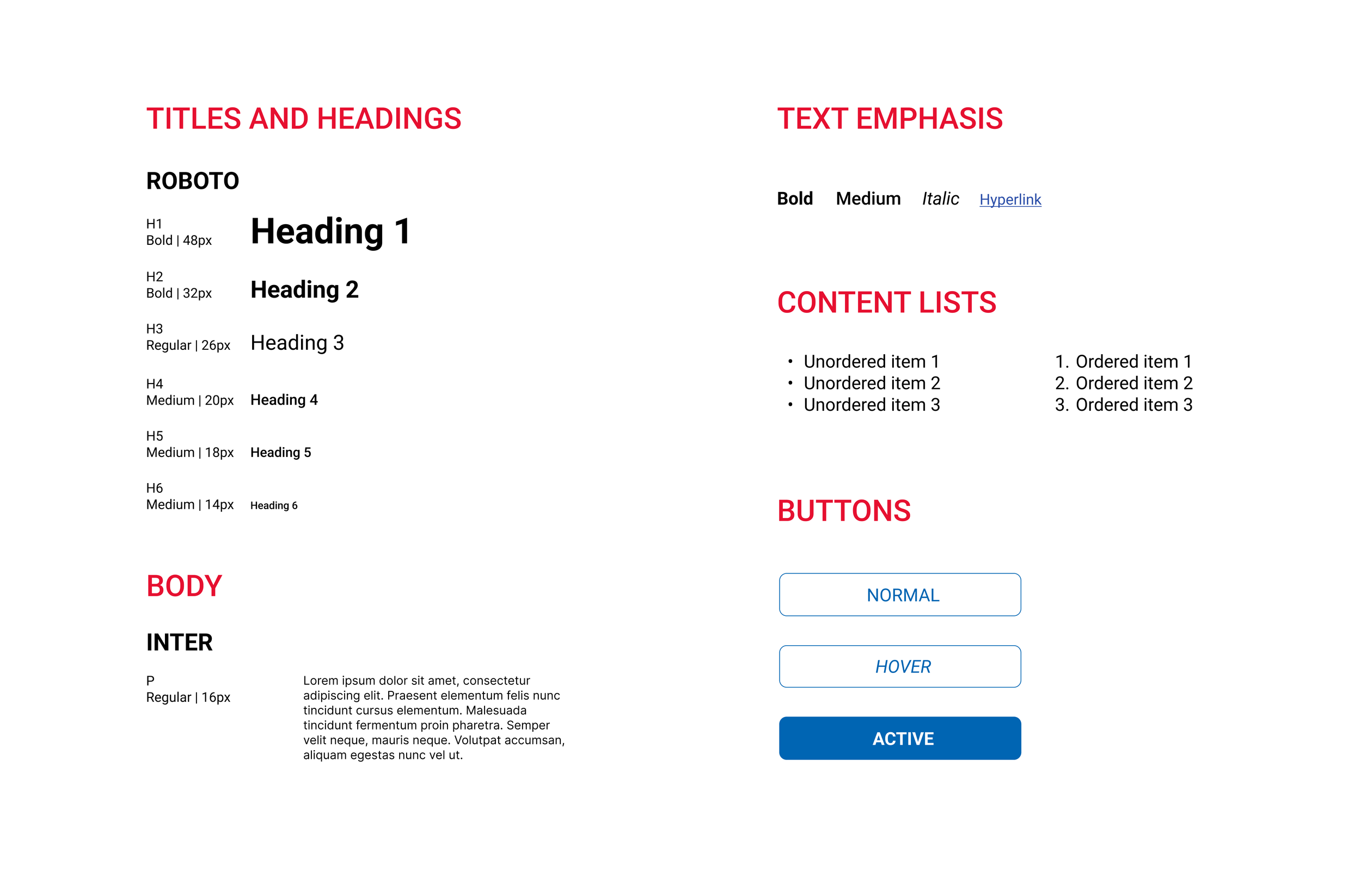
Roboto as a bold, condensed typeface is great for expressing solidity and trustworthiness.
Complimenting this font type is Inter as a body font. Though also a sans-serif font, Inter possesses wider letter spacing, which generally increases readability when it comes to displaying chains of numbers or letters.
ICONS


